Free shipping on orders over £200.00!

By Admin
Published on 2025-04-26 01:20:11

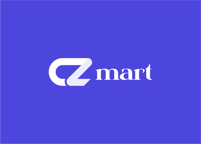
## The CZmart Challenge: Defining Simplicity CZmart, a new online marketplace for artisanal crafts, approached us with a compelling challenge: to create a logo that embodied their values of quality, simplicity, and connection. They envisioned a brand identity that felt both modern and approachable, instantly recognizable and enduring. The existing brand had a cluttered feel and didn't resonate with their target audience of design-conscious buyers and sellers. **My Role:** As the lead designer on this project, I was responsible for the entire logo design process. This included initial concept development, client presentations, iterative refinement based on feedback, and the finalization of the logo and its variations for different applications. **The Journey: Embracing Minimalism** We embarked on a journey of exploration, sketching countless concepts and experimenting with various geometric forms. The goal was to distill the essence of CZmart into a single, memorable mark. We explored abstract representations of connection, craft, and the marketplace itself. We knew we wanted to avoid anything too literal or cliché. **Technologies and Tools:** * **Adobe Illustrator:** Used for creating vector-based logo designs and ensuring scalability and sharpness across all media. * **Adobe Photoshop:** Used for mockups and presenting the logo in real-world scenarios. * **Pen and Paper:** For initial brainstorming and sketching of logo concepts. **The Solution: A Symbolic "C"** After numerous iterations, we arrived at a minimalist "C" shape, constructed from interconnected lines. This symbolized the connection between buyers and sellers, the craft itself, and the collaborative spirit of the CZmart marketplace. The clean lines and negative space conveyed a sense of modernity and sophistication, aligning perfectly with the brand's aspirations. We chose a muted color palette, consisting primarily of a sophisticated deep teal, to evoke a sense of trust and stability. A secondary palette of lighter, earthy tones was developed for use in marketing materials and website design, ensuring visual consistency across all touchpoints. **Key Achievements:** * **Developed a unique and memorable logo:** The minimalist "C" shape is instantly recognizable and reflects CZmart's core values. * **Created a versatile logo system:** The logo works effectively across various platforms, from website headers to social media profiles to packaging. * **Successfully captured the brand's essence:** The logo effectively communicates CZmart's commitment to quality, simplicity, and connection. **The Results: A Foundation for Success** The new logo was enthusiastically received by CZmart and has played a crucial role in establishing their brand identity. They reported a significant increase in positive brand perception after launching the new logo. The clean, modern design has helped them attract a more design-conscious audience, contributing to increased traffic and sales. The success of this project underscored the power of minimalist design in creating a lasting and impactful brand identity.